Esports Technologies
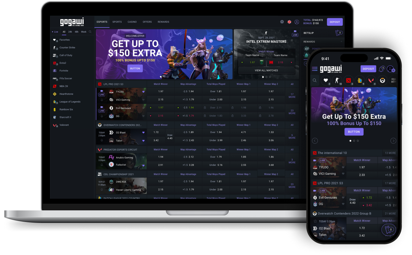
Esports Technologies (EBET) is based on a start-up culture of sprints and quick turnarounds. Shortly after its IPO, the company wanted to unveil multiple products with the user experience and unmatched betting odds as the USP. The flagship product, Gogawi, is a wagering platform dedicated to the emerging Esports industry. The goal was to push the product to Esports fans while staying relevant with seasoned Sports and Casino Bettors.
My Roles
UX Design, Interaction Design, Prototyping
The Team
Matt Stallings: Design Lead
Scottie Lau: Design
Bart Barden: Product Owner
02 The Problem
As Esports wagering grew immensely during Covid, Gogawi needed to be fiercely competitive to outshine other emerging brands. The brand and product needed to focus to the Esports audience, but not alienate the general betting crowd who was still relevant within the other verticals and was prime for peeking interest into the Esports genre. The brand and product needed to come out of the gate quickly and be functioning top notch.
When I joined EST, the existing products were generally skinned 3rd party software with nothing unique except for taking on some of the current branding. The company brought me on as they wanted their own custom products with best in class usability, user interface design, and overall experience.
03 Solutions
Over the 1.5 years working at EST, I helped out on multiple products including Gogawi, Hedgehog, Trader Tools, and Karamba. With Gogawi as the flagship product, the design team tackled interface design and usability by working together and iterating on best practices and custom solutions. Prototyping user flows to showcase to product leads, C-suite, and potential users was a weekly occurrence as rapid production was part of our success.
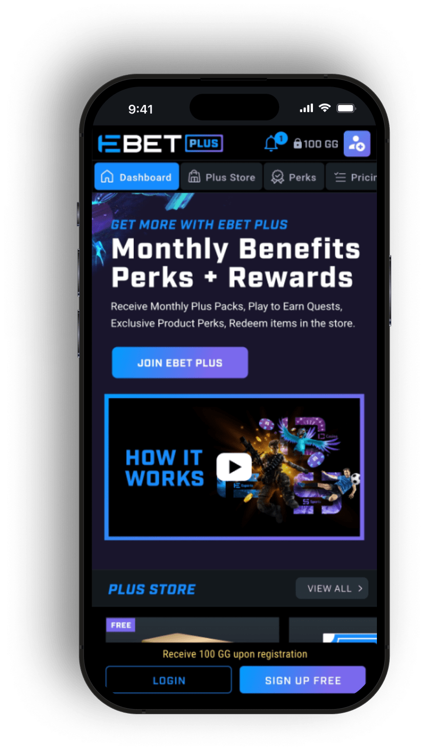
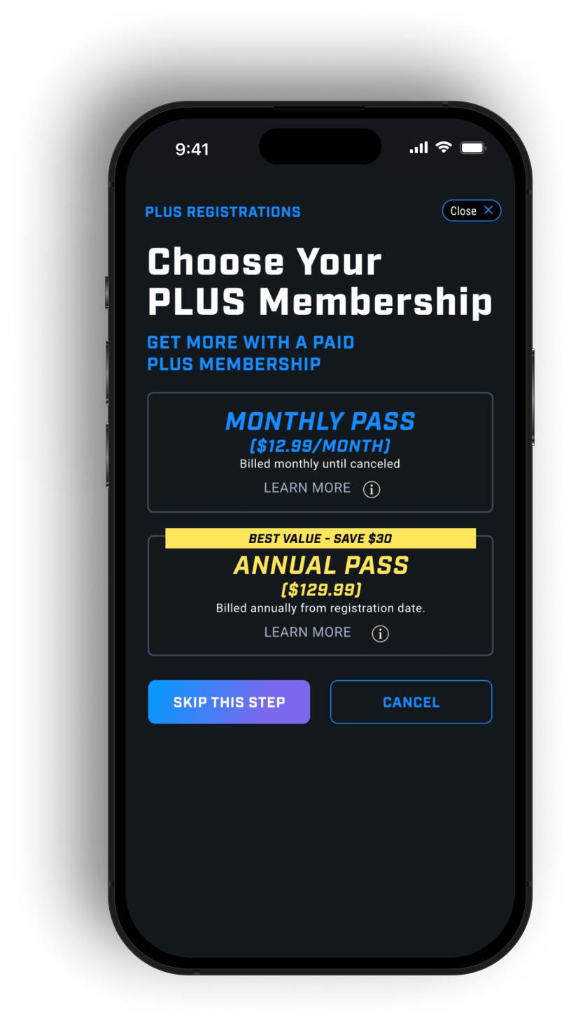
The product design team collaborated with the branding and marketing team to find solutions to a multitude of possible acquisition pipelines that could be built into the product. We also worked closely on a rewards program and subscription model to continue to entice the user base. One of the first things that was established was various target audiences which helped us foresee the approach to take.

Esports Viewers
Watches Gaming content on Youtube and Twitch. May play some esports games non-competitively but mainly enjoys esports by watching the big names and teams play.

Age 18-35 Esports Viewers
Follows Youtube and Twitch content of their favorite games, teams and players. Knows a lot about specific games that they enjoy playing. Watches the pros to get tips on how to improve their own games.

Hardcore Sports Fans
Focuses intently on singular or multiple esports games. Buys team merch. Follows the teams/players on social media and supports their public content/streamed content. Knows a lot about a little AND a little about a lot when it comes to Esports.

General Bettors
Still a major player and a lifeline in keeping up revenue goals in various existing verticals such as traditional sports, online poker and casino games, among many others.
Consistency and Delight Amongst Verticals
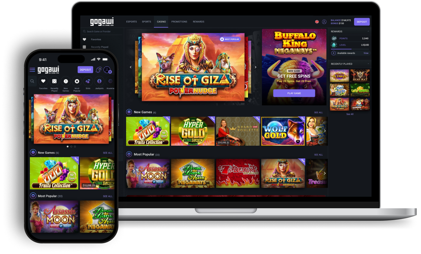
With Esports as the main driver, the Casino page needed to adopt the overall structure while still staying usable, relevant, and exciting to the general bettors audience. Both verticals began with mobile first thinking so the interface would be consistent and high-functioning with any device size.
An Assortment of User Flows to Consider
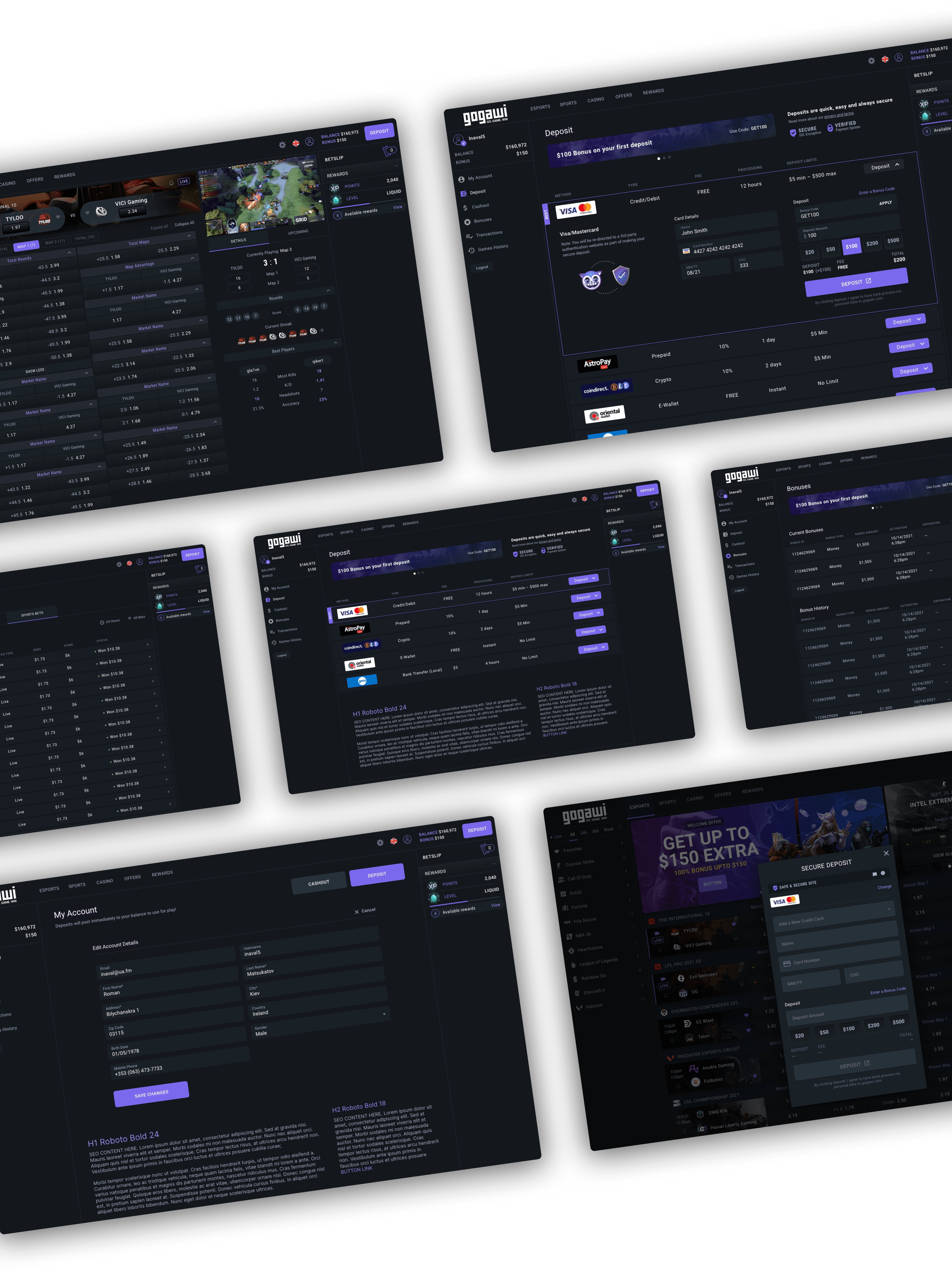
Despite simplifying the main navigation scheme to 5 main touchpoints, other flows such as placing a bet, my wallet, and the sign up process carried a multitude of scenarios and attributes to consider. Place a bet goes into a Betslip and contains all current bets while reporting on status. My wallet includes the user’s current balance along with actions such as making a deposit (complete with incentives and bonuses). The betting industry also requires identity verification where screens are needed to upload or take a pic of particular forms of documentation (within multiple countries) and uploading documents to be reviewed in the backend.
Gogawi UI Kit
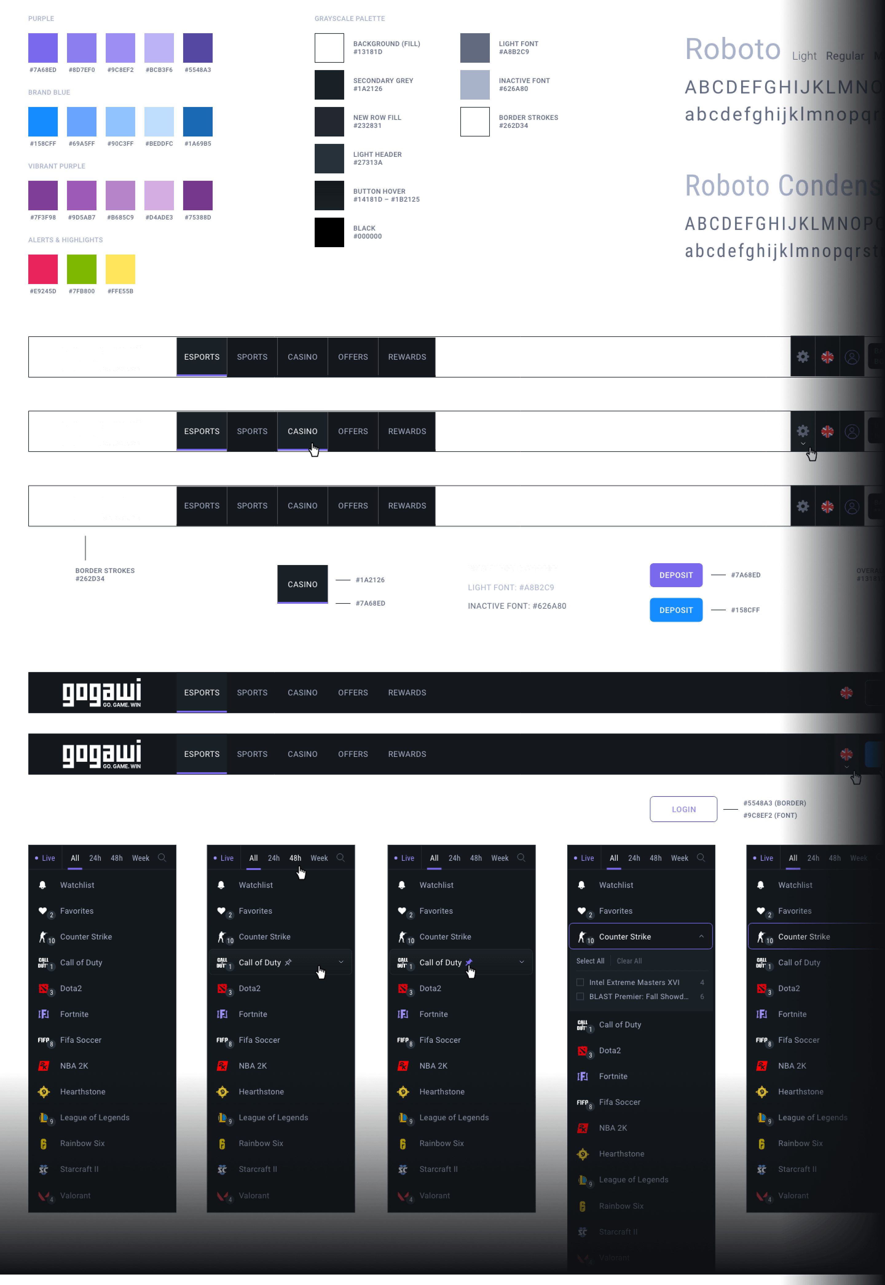
Our UI Kit was the beginnings of a full-on design system to be applied to the products planned and unplanned to be launched in the next 1-2 years. The UI Kit was one of the other areas in production where I started to get the ball rolling and passed along to others in the design team to help complete the production.
Guiding Principles for Loyalty and Subscriptions
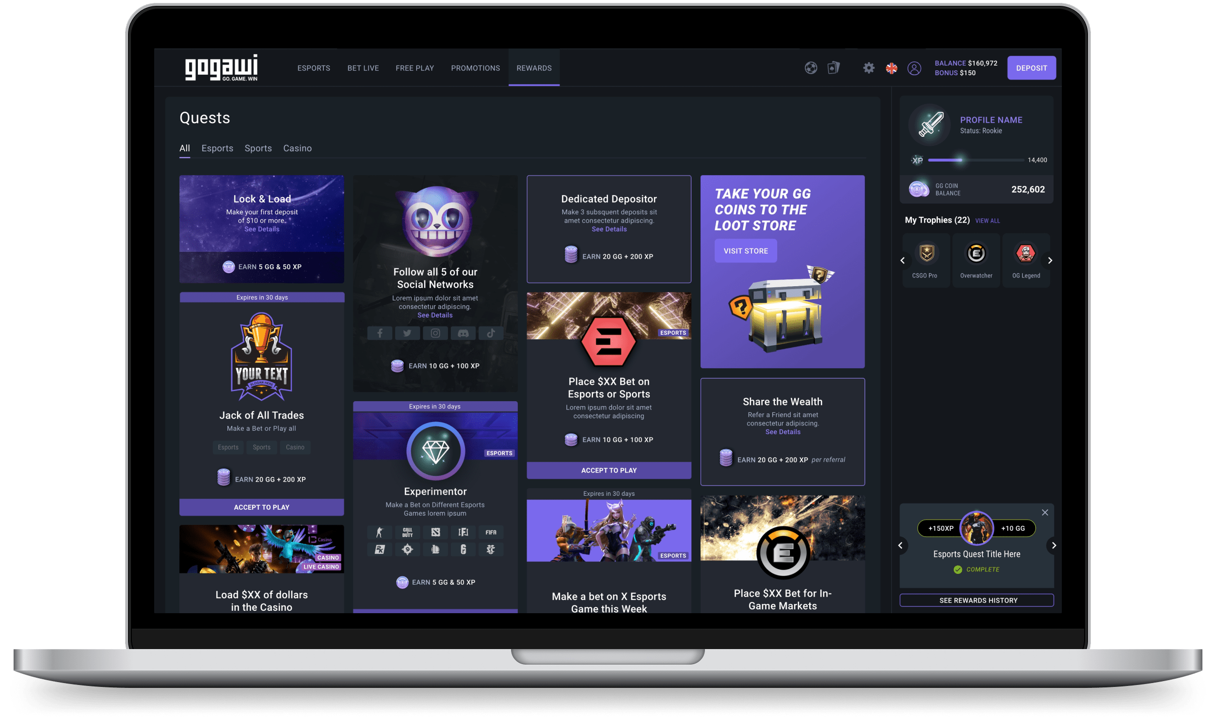
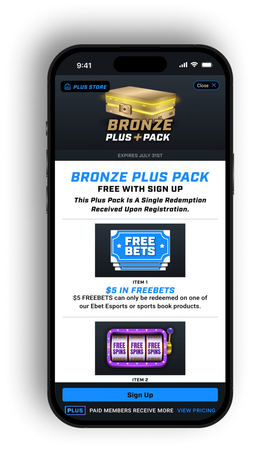
With the competitive nature of the Esports wagering industry, it was important to work with our marketing team to help evaluate and strategize on any efforts to help with acquiring leads to the user base. We gave focus to a rewards system along with subscription plans that adopted the following ethos.
We explored initiatives within Web3 to allow for buy-ins with cryptocurrency and offering NFTs as part of loyalty and community building.
Simple
Ability to earn a universal virtual currency across brands. Each Tier Benefits need to be outlined for value proposition and reason to sign-up or register.
Engaging
The program should have strategic and achievable earning milestones to encourage behaviors within the program to drive increase of desired product outcomes.
Educational
The program should provide incented content for members to train and educate themselves on gaming and wagering so they can become an informed and empowered return customer.
Rewarding
Our incentives need to be aspirational, valuable and relevant to our members.
Redemption and fulfillment of those prizes should be speedy and effortless when transferred to members’ possessions.
An MVP Wagering for Sportsbook Brokers
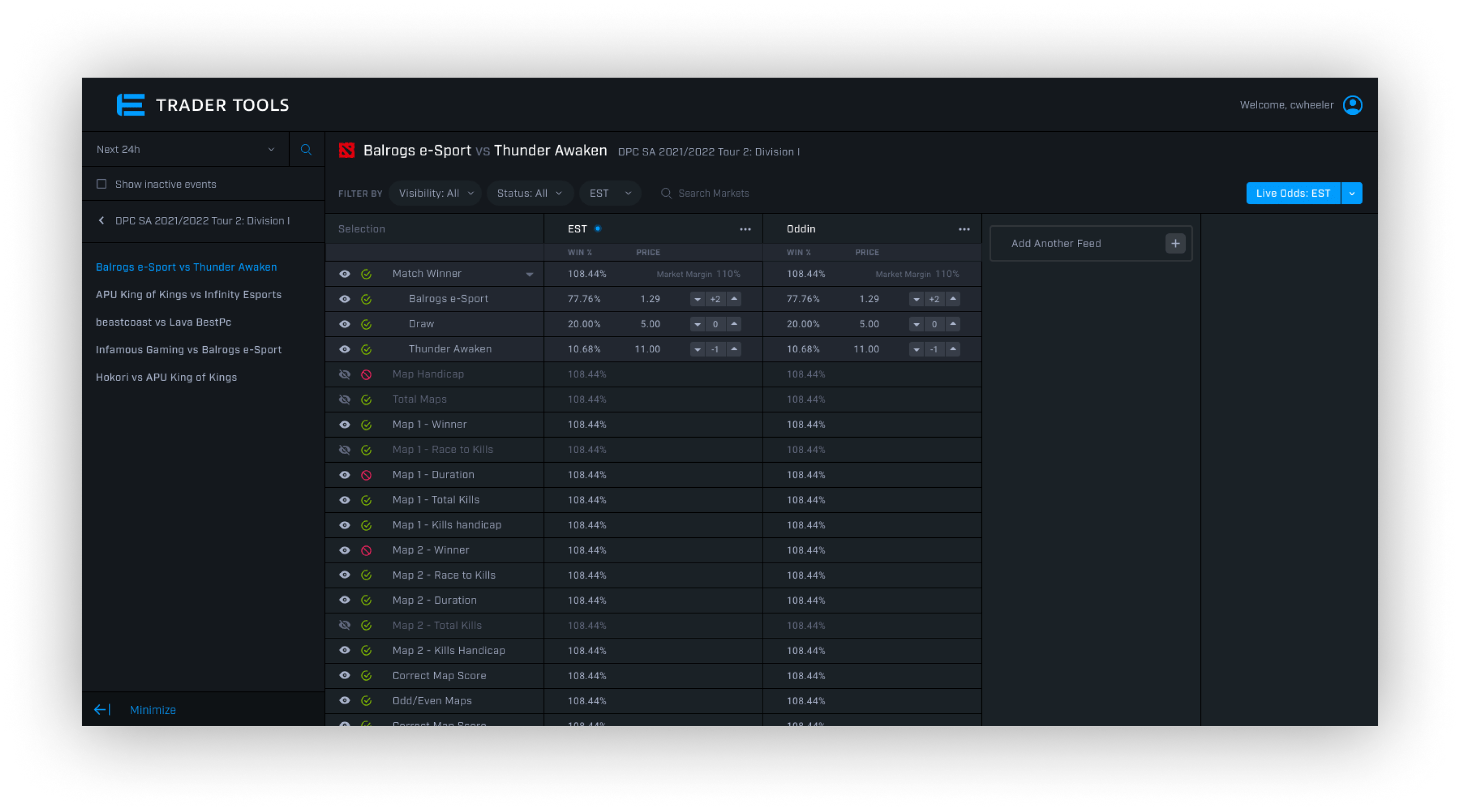
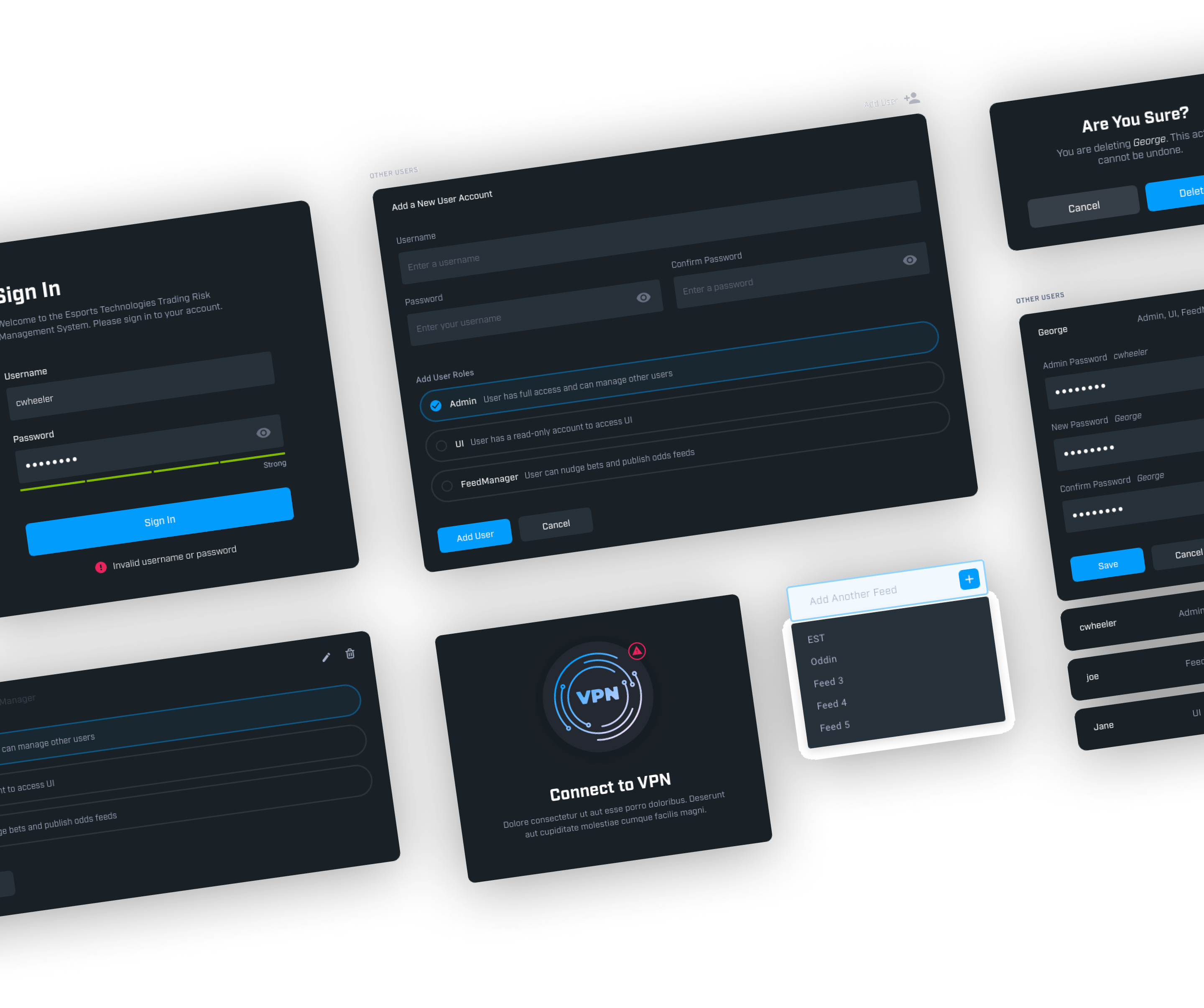
The primary goal of the Trader Tools interface was to be as quick and efficient as possible for a Sportsbook broker to change and push margins live. The typical flow is for the broker to browse and find a match that they would like to adjust. Within that match are various odds feeds that the broker may review and push live. The broker has the capacity to adjust margins per result on each feed. Since the odds are constantly moving and any number of bets may be placed at any given moment – this is a time sensitive activity and interacting with the product in as quick of manner as possible is of upmost importance.
I iterated on a number of wireframes with various approaches and did some rounds with the product owner and team to hone in on an MVP solution. Roundtable discussion, one-on-one meetings, and ultimately prototypes on a final phase 1 deliverable got us to a place to start beta testing with a handful of trial brokers.
A White Glove Experience for Seasoned Esports Bettors
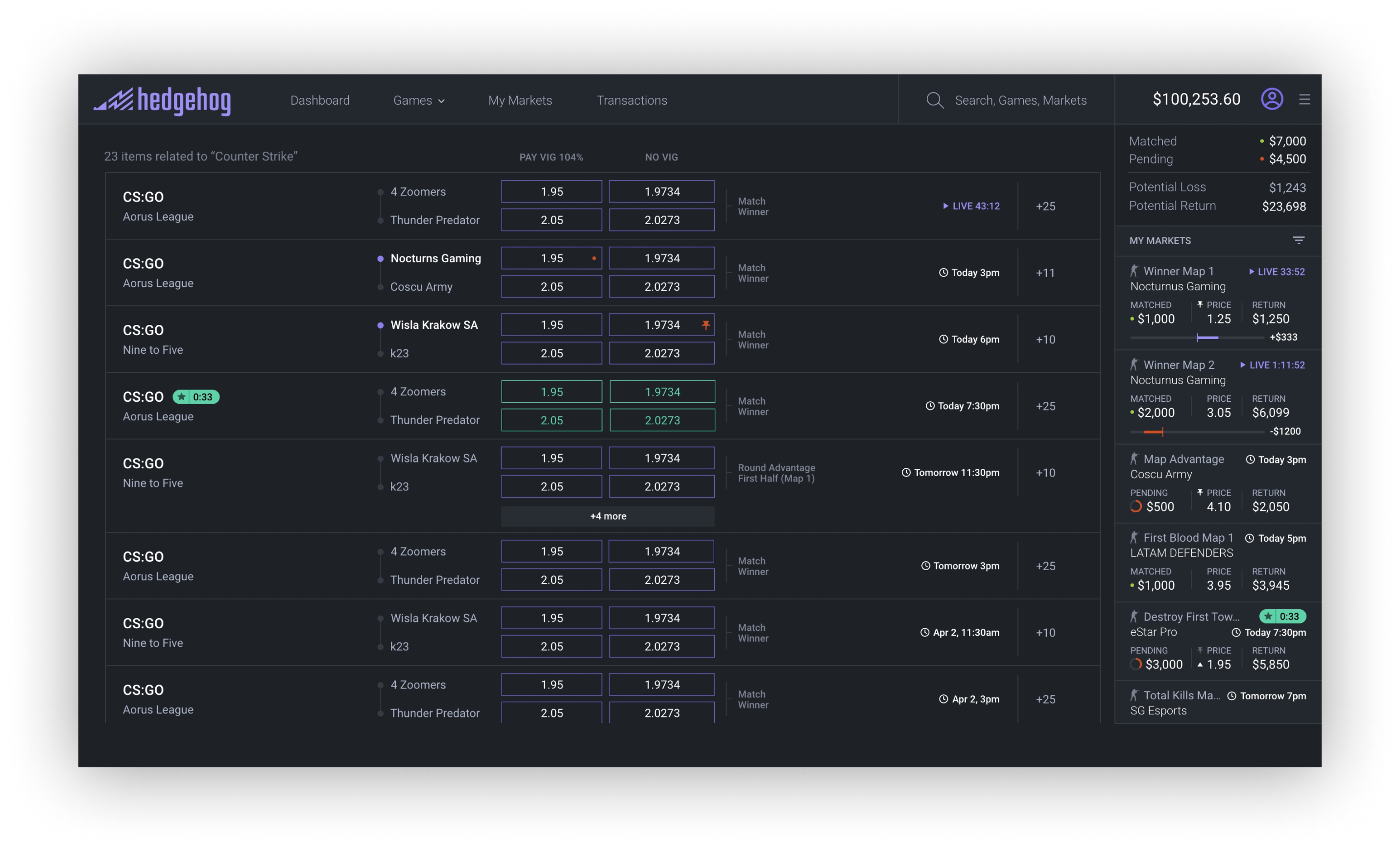
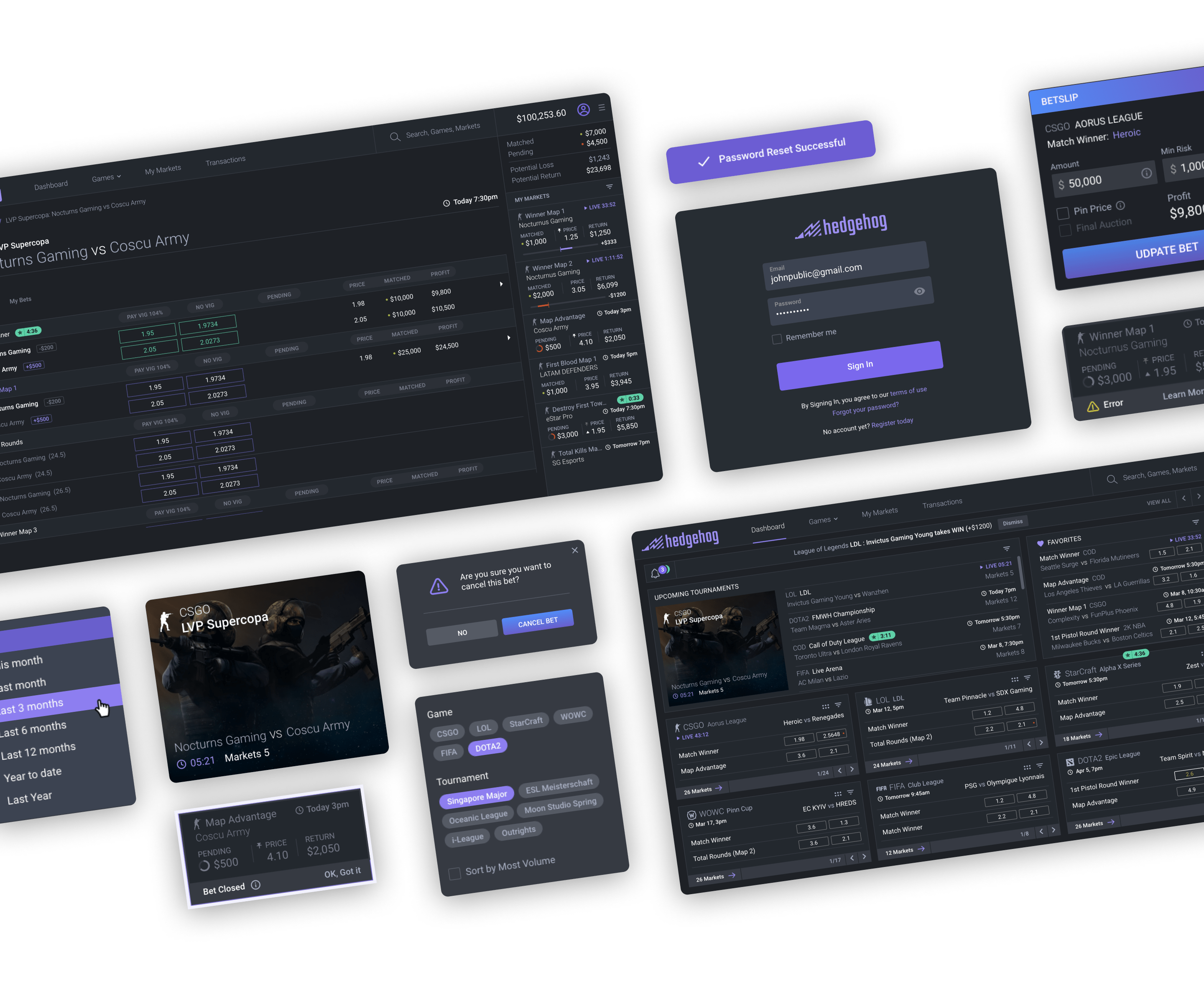
When high-dollar bets are a daily activity, the product and tools need to give the users what they need and nothing more. Hedgehog was designed to do just that. I worked solely with the product owner to iterate on the pages and flows to package up a beta version to be built exclusively for high-end bettors.
Based on customer input, I had to veer from the current design trends and go with a compact and compartmentalized format as these bettors like to see more happening on their screen all at once. The primary dashboard page was chocked full of customized widgets showcasing favorite matches, teams, leagues, etc. all with real-time stats and quick betslip access.
A unique area of interest for the users was through highlighting matches with the most action. We did this by introducing auctions and giving the user a sense of urgency to get involved using a countdown timer.
04 Conclusion and Results
The initial project goals were successful in utilizing the product concepts to help secure more funding and credibility for a start-up that went public. The regret was that the majority of the project was scrapped before it truly got out to the user base. We missed out on verifying the design and strategy using core UX practices such as usability testing and observing analytics.
Next, I would have loved to see the Design System come together, even at the stage of design that we were involved in. The UI Kit was complete and a built out Design System would have aided the team as we continued to build out sections of each product.
